Logo of Green Day Indicators

{ SHOP }

TRADING TOOL - DAILY GAP UP STATISTICS BUNDLE

Daily Gap Up Bundle Study of $CLNE in a Daily Candlestick Chart for thinkorswim.

SALE!

Up to 20% off our thinkorswim custom thinkscripts.


DAILY GAP UP STATS BUNDLE

Long Dark Green Bar

Price $499

SALE $425

Secured by PayPal
Long Dark Green Bar

History tends to repeat itself.

The historical behavior of a stock may help make future decisions.

This DAILY GAP UP STATS BUNDLE contains the following studies:

These above studies can be purchased individually. 

An Exclusive FREE Bonus to the Gap Bundles.


Two studies not sold individually:


YEARLY HIGHS AND LOWS (details below)

AVERAGE and UNUSUAL VOLUME LABEL (details below)

Checkout these examples of the Daily Gap Up Stats Bundle.

This bundle is for daily candlestick in a yearly chart.

Daily Gap Up Bundle Study of $APPS in a Daily Candlestick Chart for thinkorswim.

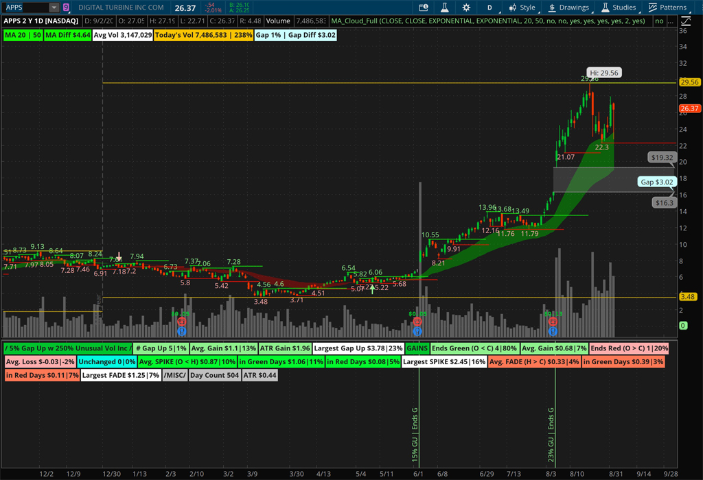
Daily Gap Up Bundle Study in a Daily Candlestick Chart. 1/3

Daily Gap Up Bundle Study of $APPS with descriptive bubbles in a Daily Candlestick Chart for thinkorswim.

Daily Gap Up Bundle Study in a Daily Candlestick Chart. 2/3

Daily Gap Up Bundle Study of $SHLO in a Daily Candlestick Chart for thinkorswim.

Daily Gap Up Bundle Study in a Daily Candlestick Chart. 3/3

Gap Up Stats Labels in Details

Gap Up Stats thinkorswim Study Labels in Details.

Gap Up Stats thinkorswim Study Labels in Details.

The first label tells you what you are looking at:

  • The specific Gap Up %.
  • And the specific Unusual Volume %.

The next few labels tell you about the GAP UPS:

  • The number (#) of Gap Ups and its the percentage overall (i.e. How often it happens?).
  • The average gain in $ and %.
  • Average ATR Gain in those Gap UPS.
  • Then the Largest Gap Up in $ and %.

Then the next few are the Gains labels (How its ends/closes? or Does it holds its gains?):

  • How many days does it end up as a Green day and its percentage?
  • The average gain in $ and % on those Green days.
  • How many days does it end up a Red day and its percentage?
  • The average gain in $ and % on those Red days.
  • And if there is any unchanged days ie the open is equal tothe close (O = C).

The next few labels are what I call SPIKEABILITY (O < H) - (How the stock behaves from open to reach its high of day!):

  • What is its average SPIKE gain from Open to the High in $ and % overall?
  • And even more specifically in Green or Red days.
  • It also give the Largest SPIKE in $ and %.

The next few labels are what I call FADEABILITY (H > C) - (How the stock behaves once it has reached its high of day in relation to its close!):

  • What is its average FADE loss from the High to Close in $ and % overall?
  • And even more specifically in Green or Red days.
  • It also give the Largest FADE in $ and %.

Lastly the miscellaneous labels tell you:

  • the overall daily count.
  • and the usual ATR.
Gap Up Stats Explained in Details for a Green Day for $WORX.

Gap Up Stats Explained in Details for a Green Day. 1/2

Gap Up Stats Explained in Details for a Red Day for $AEHL.

Gap Up Stats Explained in Details for a Red Day. 2/2

Average and Unusual Volume Labels and Settings

This Average and Unusual Volume study draws labels with the average volume over a particular length, today’s volume, and the percentage compare to the average volume.

The colors of the label depends on the setting of Unusual Volume Percentage activity:

  • if today's volume is under 100% of the average volume then its 'gray',
  • if today’s volume is between 100% and the unusual volume percentage then its 'yellow',
  • if today’s volume is above the unusual volume percentage then its 'green'.

The Settings have the ability to change the length on which the average volume is calculated. Also, has the ability to change the unusual volume percentage.

Also, the color of all the labels can be changed to your liking.

Average and Unusual Volume Labels for $VVPR in thinkorswim.

Average and Unusual Volume Labels. 1/2

Average and Unusual Volume Labels Settings in thinkorswim.

Average and Unusual Volume Labels Settings in thinkorswim. 2/2

Yearly Highs and Lows Study and Settings

This Highs and Lows study draws lines at the Years high and low.

The Settings have the ability to change the aggregation of the period (to day, week, month, quarter, etc) by default is set toYear. It can also be modified for the length of time, by default it is set to one.

Also, the color of the lines can be changed to your liking.

Example of Yearly Highs and Lows thinkorswim Study for $MRNA.

Example of Yearly Highs and Lows thinkorswim Study for $MRNA. 1/2

Example of Yearly Highs and Lows thinkorswim Settings.

Example of Yearly Highs and Lows thinkorswim Settings. 2/2

Long Dark Green Bar
PayPal Acceptance Mark
Long Dark Green Bar